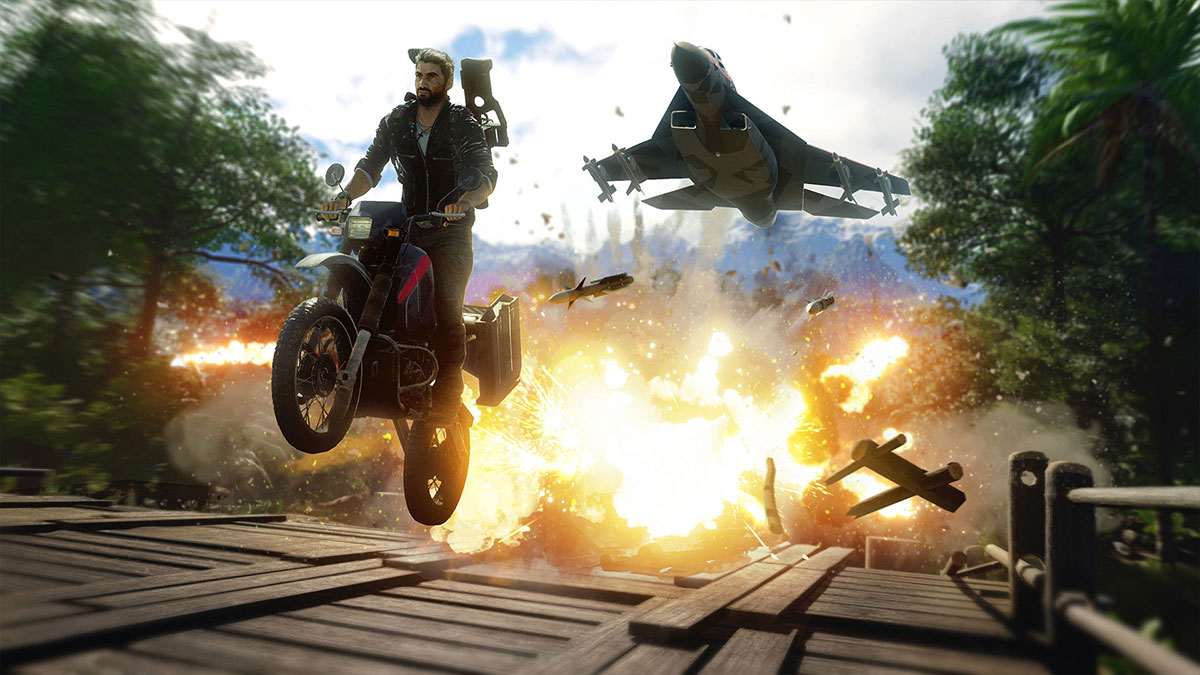
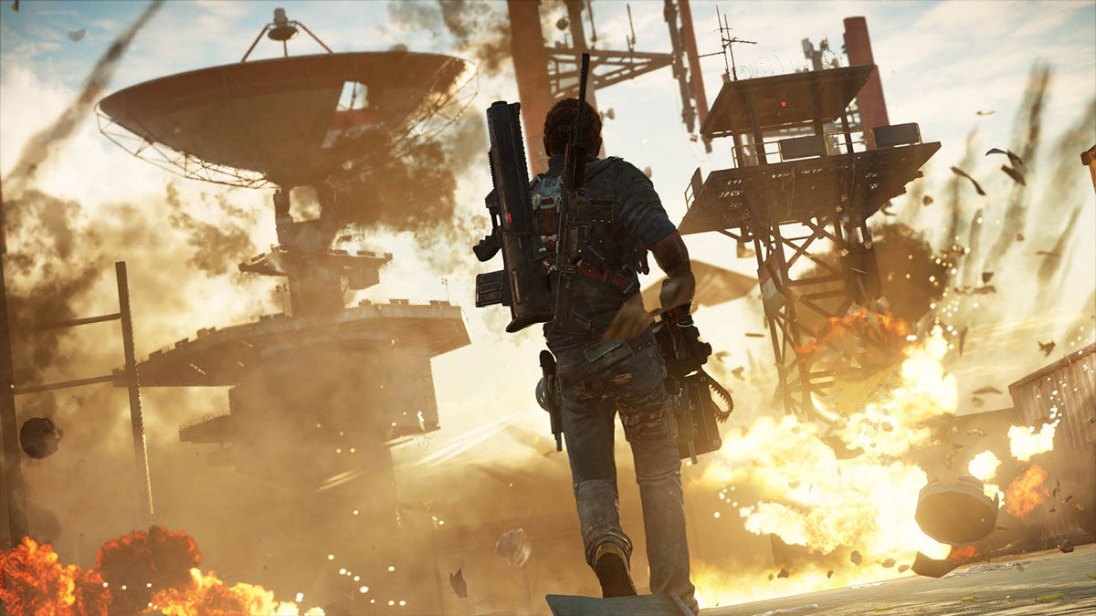
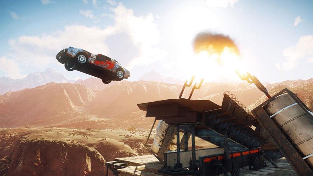
Watch this Just Cause 4 vs Just Cause 3 Graphics Comparison video showcasing downgrade in Water Effects, Lighting, Explosion Effects, Character Models, and Texture.
Whenever a new game in the video game series comes out it is expected that the performance of the various elements in the new installment will be better than it’s a predecessor. Just Cause fans had these same expectations from the Just Cause 4, but it failed to live up to it. Just Cause 4 released on December 4, and within few hours of its launch, multiple posts started to appear on game’s official forums and Steam that the graphics and visual effects have been downgraded, it does not even match with what we have seen in the previous installment, Just Cause 3. Are these allegations true?
YouTuber Nick930 decided to do a little bit of investigation of his own to check out how true these Just Cause 4 graphics downgrade allegations are? The result of Nick930’s investigation is the following video: Just Cause 4 vs Just Cause 3 | Direct Comparison – it compares Character Models, Lighting, Texture, Explosion, Water, and other effects of Just Cause 3 vs Just Cause 4.
According to the details shared in the video, there has been a bit of a downgrade in Just Cause 4. Few users on Reddit supported the claims made in the video, in fact, they stated that the situation is even worse.
hader_brugernavne says: “I’ve only played the Xbox One (X) version, and it has a lot of extremely blurry textures, weird hair and absolutely atrocious water (it’s much worse than can be seen in the video). A lot of the textures are honestly fine, but there are enough blurry ones to ruin the overall presentation. Everything in the game looks pretty good to me from a distance, but up close it just looks like the game isn’t entirely done.”
LoopingLouie90 says: “In this video JC4 actually looks quite decent. the AA, lightning, and textures are very very very bad on my “very high” settings on PC. and somehow the game looks like it only uses 64 colors… the transition between shades isn’t smooth”
Zy-D4rKn3ss says: “The water on ps4 pro doesn’t even look like the one on the right side of the screen… It’s more like an early ps3 water design.”
What do you guys think? Share your opinion with us in the comment section below.


Published: Dec 6, 2018 10:46 am