World of Warcraft: Dragonflight UI changes and improvements, explained
Modernizing a relic.

Image via Blizzard
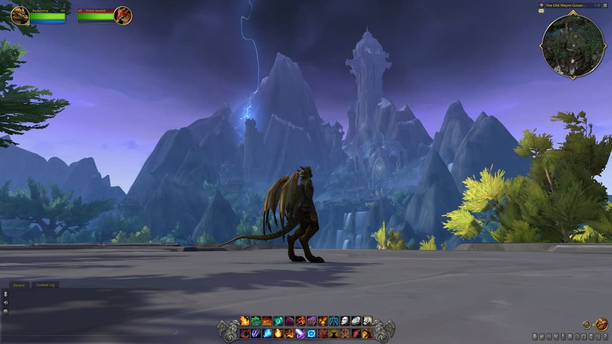
World of Warcraft has changed quite a bit over the course of its lifespan, but one thing has remained largely constant — the user interface. Add-on developers have largely taken it upon themselves to provide players with a more modern and customizable UI, but Blizzard is finally doing a complete overhaul to the in-game user interface in the Dragonflight expansion.
The team has been working hard to modernize the UI and HUD while still retaining the personality and charm of the classic version. The developers have removed a lot of clutter and made important elements like the minimap and health bars look noticeably larger. The biggest quality-of-life change is allowing all UI and HUD elements to be repositioned and customized to wherever the player would like to place them. This creates a fresh look that is modular and unique to each player.
UI profiles can also be saved and will swap based on characters and even specializations. As a show of good faith, the iconic gryphon art bar has remained and been updated to go with the modern design. The developers have also created a wyvern version for Horde players.
Fans who want to continue to use their customized UI add-ons are free to do so. The goal of this revamp is to allow players who wish to play with little or no add-ons the ability to use in-game resources to accomplish it. Blizzard has stated that the initial screenshots are very much a work in progress, but the studio also wants each component to have various sets of options to even further tailor them to your needs. Dragonflight might still be a ways off, but the reveal has given many reasons for fans to remain cautiously optimistic about the future of the MMO.